Now, you want to use the knowledge of Microsoft Excel that you have gained in your office. Your manager has asked you to create a report showing the variance between the actual and projected results. You realize that just looking at numbers does not give a clear picture. Therefore, you decide to use the powerful charting feature of Microsoft Excel.
Discuss the following in relation to charts:
What are the different ways of representing numerical data? What does each type of chart represent? Does each chart have a different or specific function? Explain with the help of examples.
In the meeting, your manager is impressed. He now asks you to change the data in worksheets for January, February, and March, as it has now been finalized. As the data changes, so do the chart and the report you created. Your manager questions you as to how this was achieved.
Discuss with reference to the following:
Linking worksheets and 3-dimensional (3D) formulas
Expert Answer
Various ways of representing data are:
- Tables
- List
- Chats
- Hierarchical diagram
Based on the type of data excel provides you different types of charts that suit your purpose.
Column Chart:
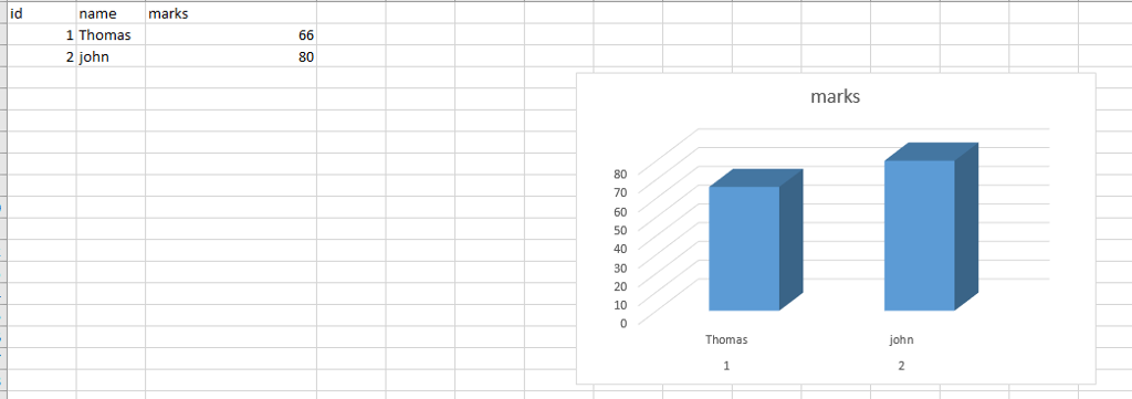
Column Chart displays the categories along the horizontal (category) axis and values along the vertical (value) axis. To create a column chart, arrange the data in columns or rows on the worksheet.
Line Chart
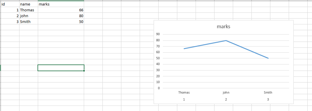
Line charts can show continuous data over time on an evenly scaled Axis. They are ideal for showing trends in data at equal intervals, such as months, quarters or years.
In a Line chart,
Category data is distributed evenly along the horizontal axis.
Value data is distributed evenly along the vertical axis.
To create a Line chart, arrange the data in columns or rows on the worksheet.
Pie Chart
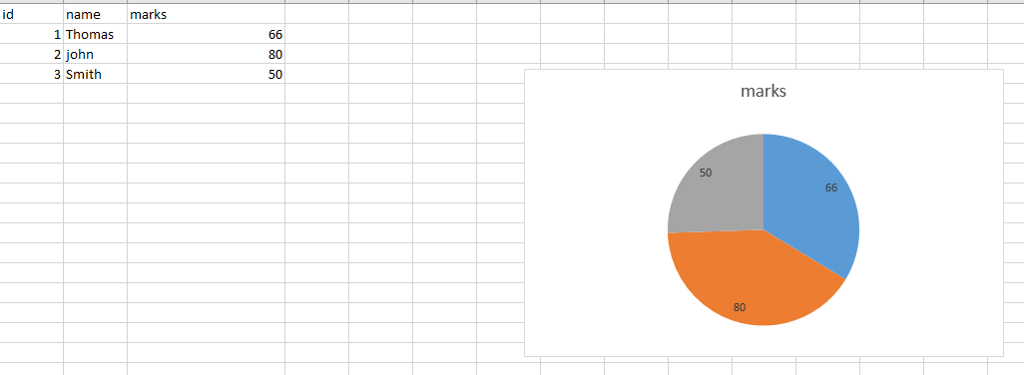
Pie charts show the size of items in one data series, proportional to the sum of the items. The data points in a pie chart are shown as a percentage of the whole pie. To create a Pie Chart, arrange the data in one column or row on the worksheet.
Area Chart
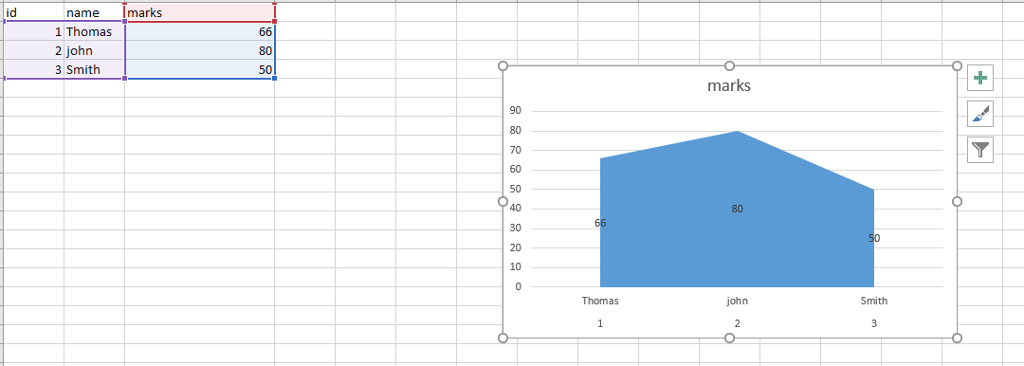
Area Charts can be used to plot the change over time and draw attention to the total value across a trend. By showing the sum of the plotted values, an area chart also shows the relationship of parts to a whole. To create an Area Chart, arrange the data in columns or rows on the worksheet.
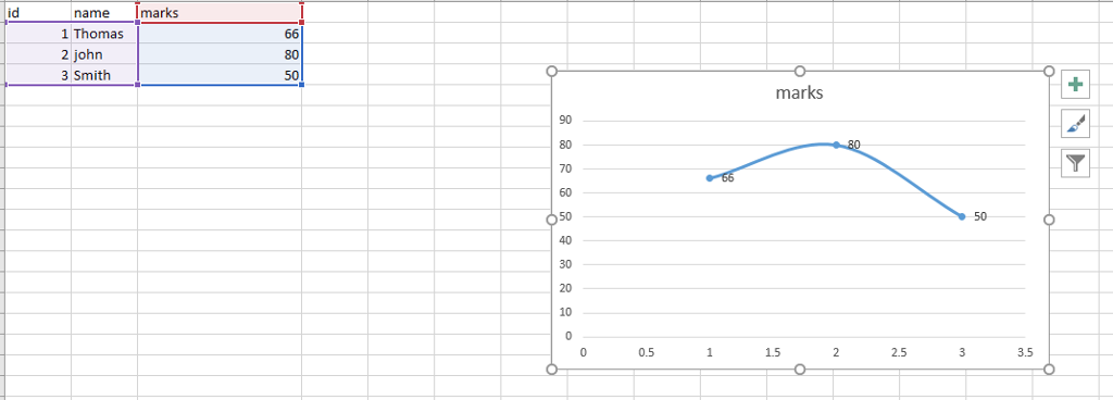
XY (Scatter) Chart
XY (Scatter) charts are typically used for showing and comparing numeric values, like scientific, statistical, and engineering data.
It combines x and y values into single data points and displays them in irregular intervals, or clusters. To create a Scatter chart, arrange the data in columns and rows on the worksheet.
Place the x values in one row or column, and then enter the corresponding y values in the adjacent rows or columns.
Consider using a Scatter chart when −
- You want to change the scale of the horizontal axis.
- You want to make that axis a logarithmic scale.
- Values for horizontal axis are not evenly spaced.
- There are many data points on the horizontal axis.
- You want to adjust the independent axis scales of a scatter chart to reveal more information about data that includes pairs or grouped sets of values.
- You want to show similarities between large sets of data instead of differences between data points.
- You want to compare many data points regardless of the time.
- The more data that you include in a scatter chart, the better the comparisons you can make.
Stock Chart
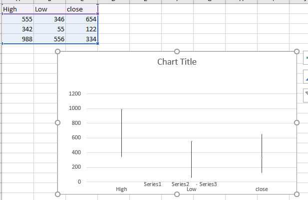
As the name implies, Stock charts can show fluctuations in stock prices. However, a Stock chart can also be used to show fluctuations in other data, such as daily rainfall or annual temperatures.
To create a Stock chart, arrange the data in columns or rows in a specific order on the worksheet. For example, to create a simple high-low-close Stock chart, arrange your data with High, Low, and Close entered as Column headings, in that order.
Surface Chart
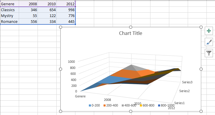
A Surface chart is useful when you want to find the optimum combinations between two sets of data. As in a topographic map, colors and patterns indicate areas that are in the same range of values.
To create a Surface chart −
- Ensure that both the categories and the data series are numeric values.
- Arrange the data in columns or rows on the worksheet.
Radar Chart
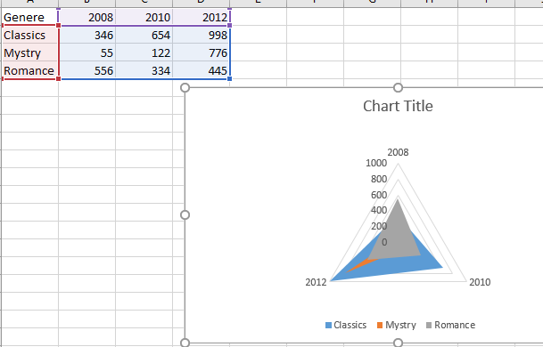
Radar charts compare the aggregate values of several data series. To create a Radar chart, arrange the data in columns or rows on the worksheet.
